Portfolio
A chronological journey through my artistic evolution, exploring themes of nature, place, and memory.
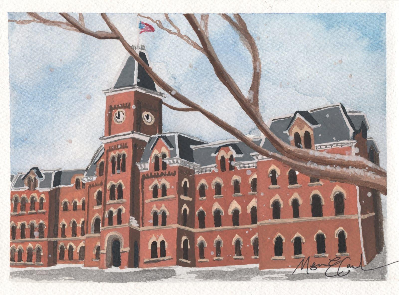
University Hall
University Hall continues my Ohio State series with a focus on architectural detail. This 5x7 watercolor captures one of the most recognizable buildings on the Oval. I was drawn to its repetition of arched windows, the symmetry of the façade, and the clock tower that anchors the structure. The red brick against a muted winter sky felt like a study in contrast and form. Rather than emphasizing the activity of campus life, this piece highlights the building itself — its structure, its rhythm, and its permanence. University Hall faces the Oval as a quiet constant, and I wanted the painting to reflect that steadiness.
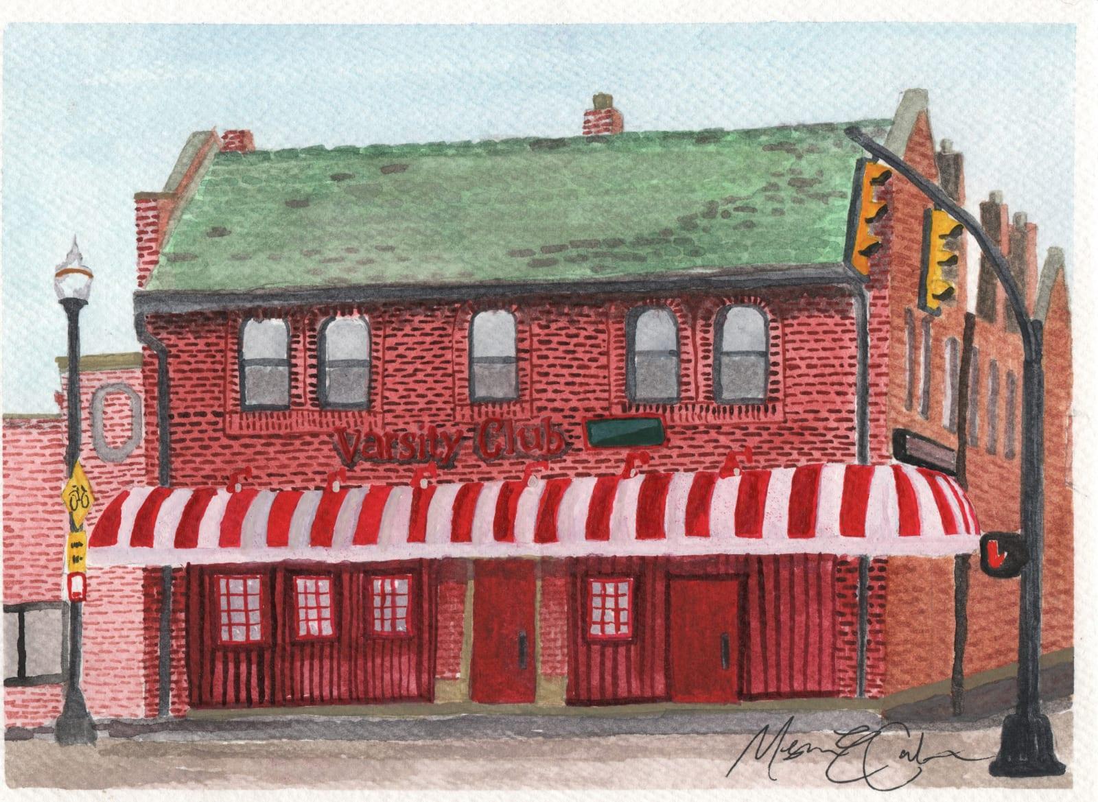
Varsity Club
The Varsity Club continues my Ohio State series by focusing on one of campus’s most recognizable gathering places. Painted in watercolor at a 5x7 scale, the piece highlights the historic brick façade, striped awning, and signature green roof that make the building instantly identifiable. I was drawn to its architectural character — it’s not grand like the stadium, but it carries its own weight through familiarity. For alumni and students alike, the Varsity Club represents community as much as tradition. It’s tied to game days, reunions, and the kind of shared experiences that extend beyond campus years. This piece captures the building in stillness, allowing its structure and color to speak for itself.
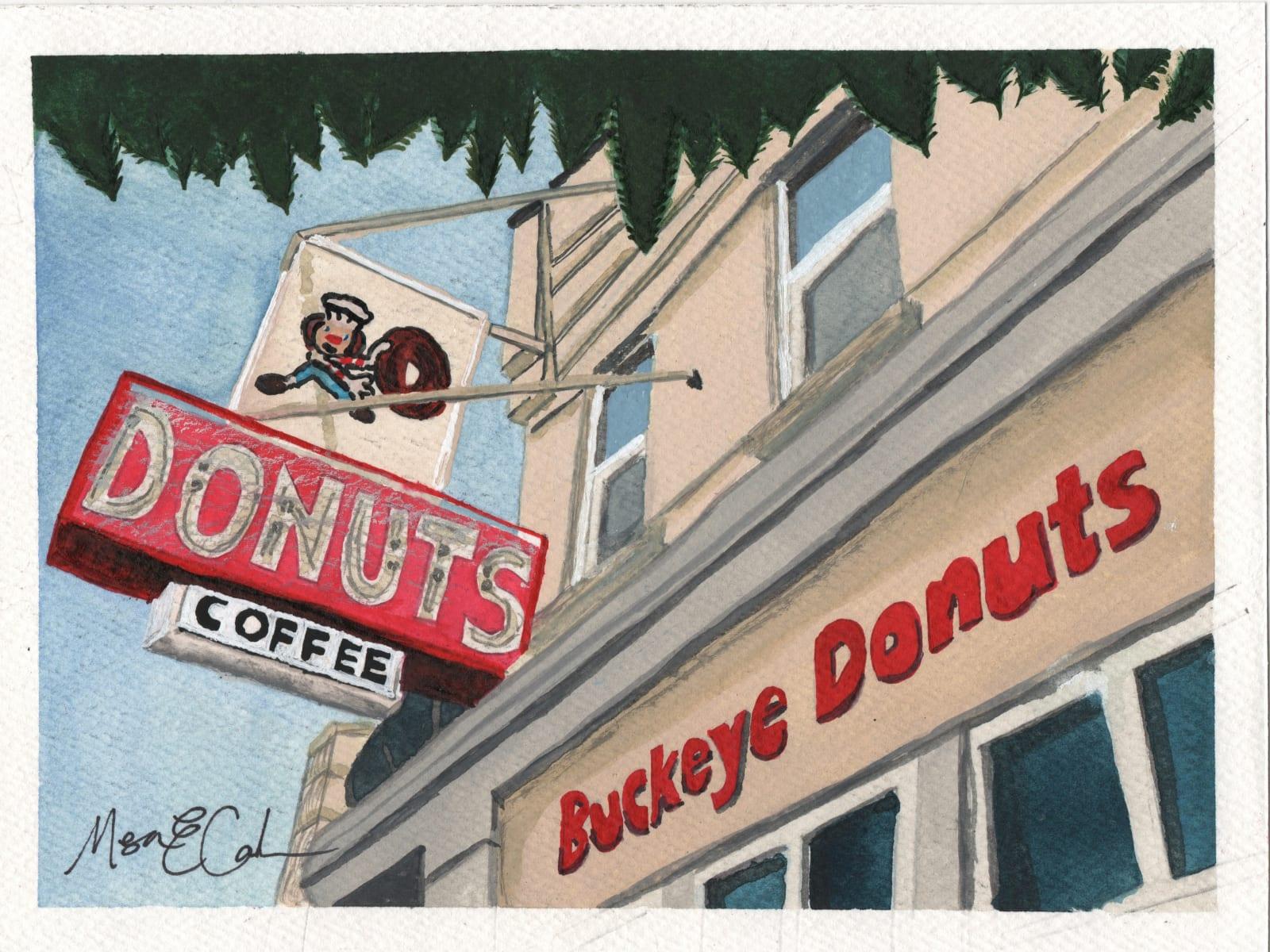
Buckeye Donuts
Buckeye Donuts is my fifth piece in the Ohio State collection, and one that feels especially personal. As an alum, this storefront holds more than just bright neon and bold signage — it holds late nights, early mornings, and everything in between. It’s one of the few places on campus that exists perfectly in both timeframes. Painting it in watercolor felt like preserving a shared memory. The vintage sign, Brutus perched above with a donut in hand, the upward angle of the building — it all reflects the way this place lives in memory: iconic, slightly nostalgic, and deeply woven into the rhythm of campus life. For many of us, Buckeye Donuts isn’t just a stop — it’s a chapter.
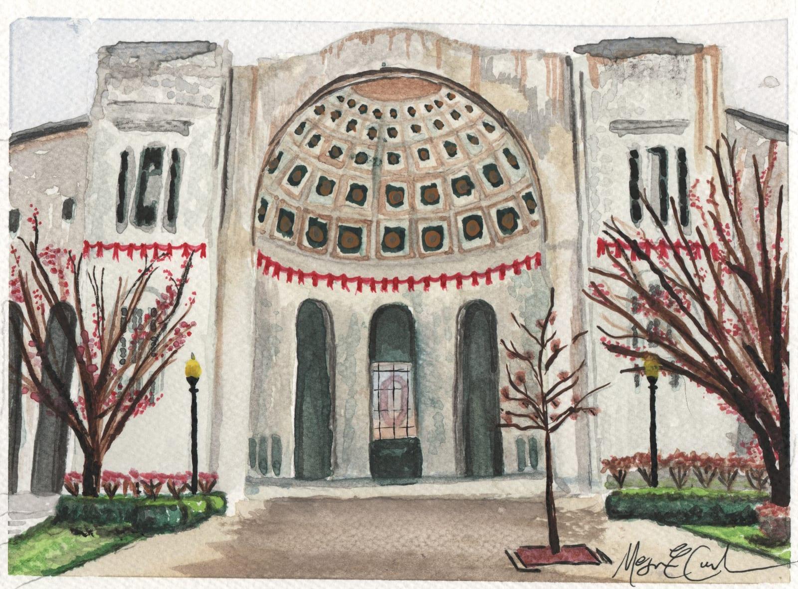
Rotunda
No Ohio State collection would feel complete without the stadium. This watercolor captures the rotunda at the Shoe — not on game day, but in stillness. I was drawn to the symmetry of the arches, the rhythm of the columns, and the detail in the dome. The structure carries so much energy in reality, yet in this piece I wanted to focus on its architecture rather than its noise. Part of my Ohio State collection, this painting reflects how place can hold memory even in quiet moments. The stadium is known for its scale and spectacle, but here it’s reduced to form, balance, and presence.
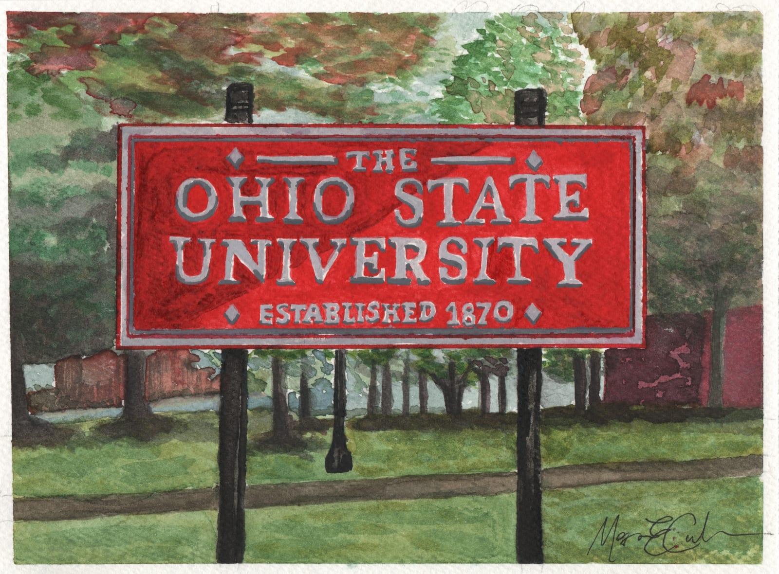
OSU Placard
OSU Placard captures one of Ohio State’s most photographed landmarks in saturated watercolor and unapologetically bold color. A personal ode to my alma mater — and one of my first explorations into watercolor — this piece holds both history and beginnings.
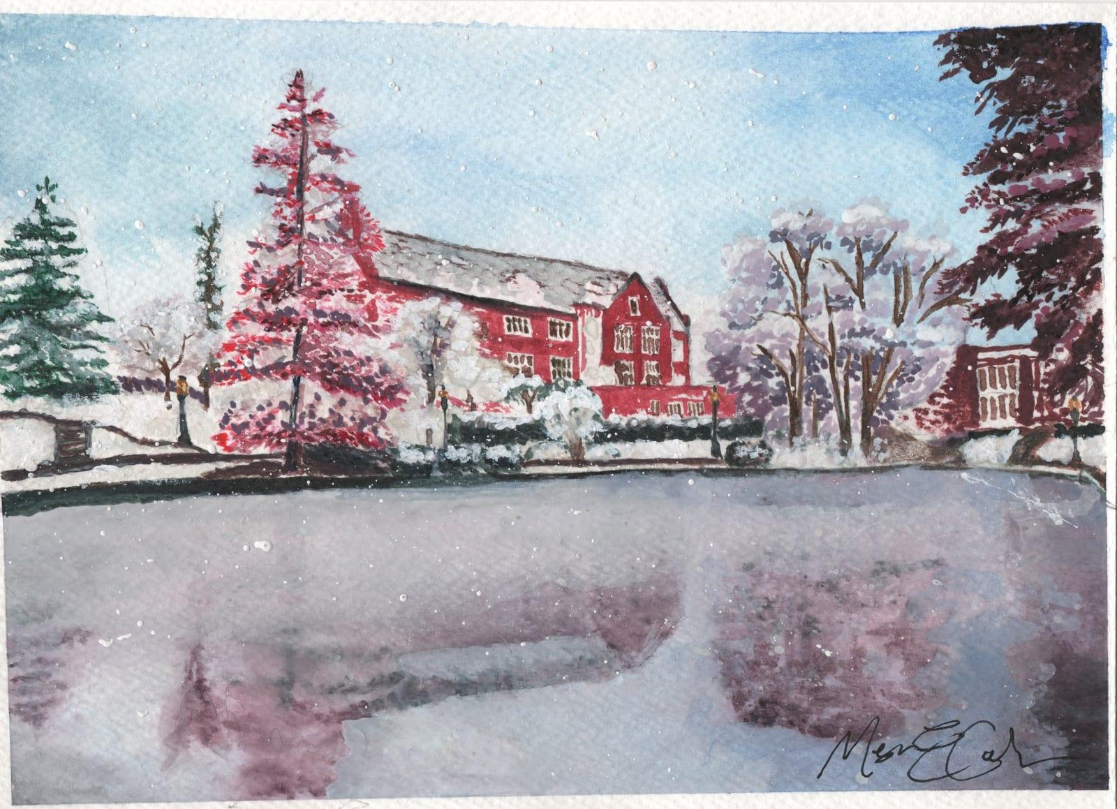
Mirror Lake
Mirror Lake is part of my Ohio State collection and captures campus in its quietest season. Painted in watercolor, the scene shows the lake frozen over, framed by snow-covered trees and red brick buildings softened by winter light. I was thinking about finals week — long study sessions, coffee cups nearby, snow falling outside the window, and the anticipation of heading home for break. Mirror Lake is one of the most recognizable spaces on campus, but in winter it feels different — still, muted, reflective. This piece leans into that calm. It’s less about the rush of campus life and more about the pause before it resets.
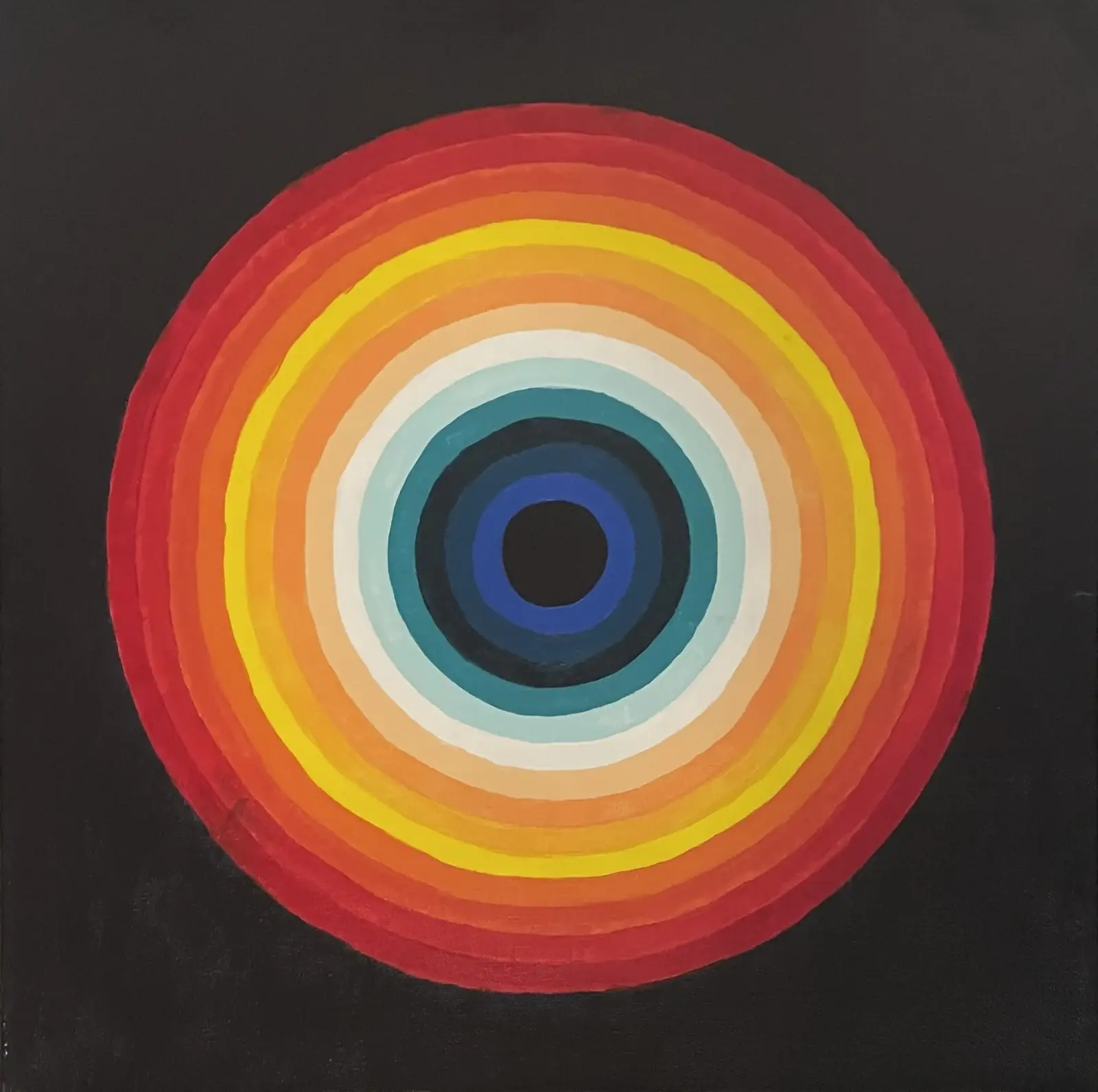
Mars Eye
Inspired by Morgan Echols’ optical techniques, I focused on precision and repetition. Each concentric ring required patience and steady handling to maintain clean, consistent edges. As the circles expand, the color shifts from cool blues to warmer reds and oranges, creating subtle visual tension. The composition references both an eye and a planetary form, inviting focus without dictating interpretation.
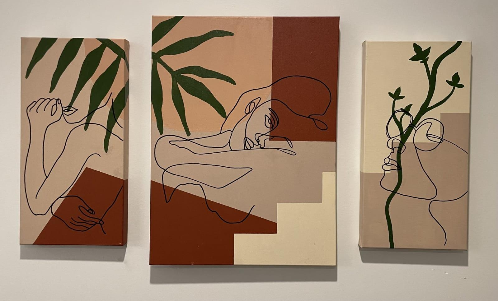
Between Form
This triptych was an exploration of balance — between geometry and gesture, structure and line. Created in acrylic on three canvases, the composition combines flat, intentional color blocking with continuous line work layered over the surface. It was my first time incorporating paint marker over dried acrylic, which introduced a new level of pressure: once the line touched the canvas, there was no revising it. The process demanded confidence and restraint.
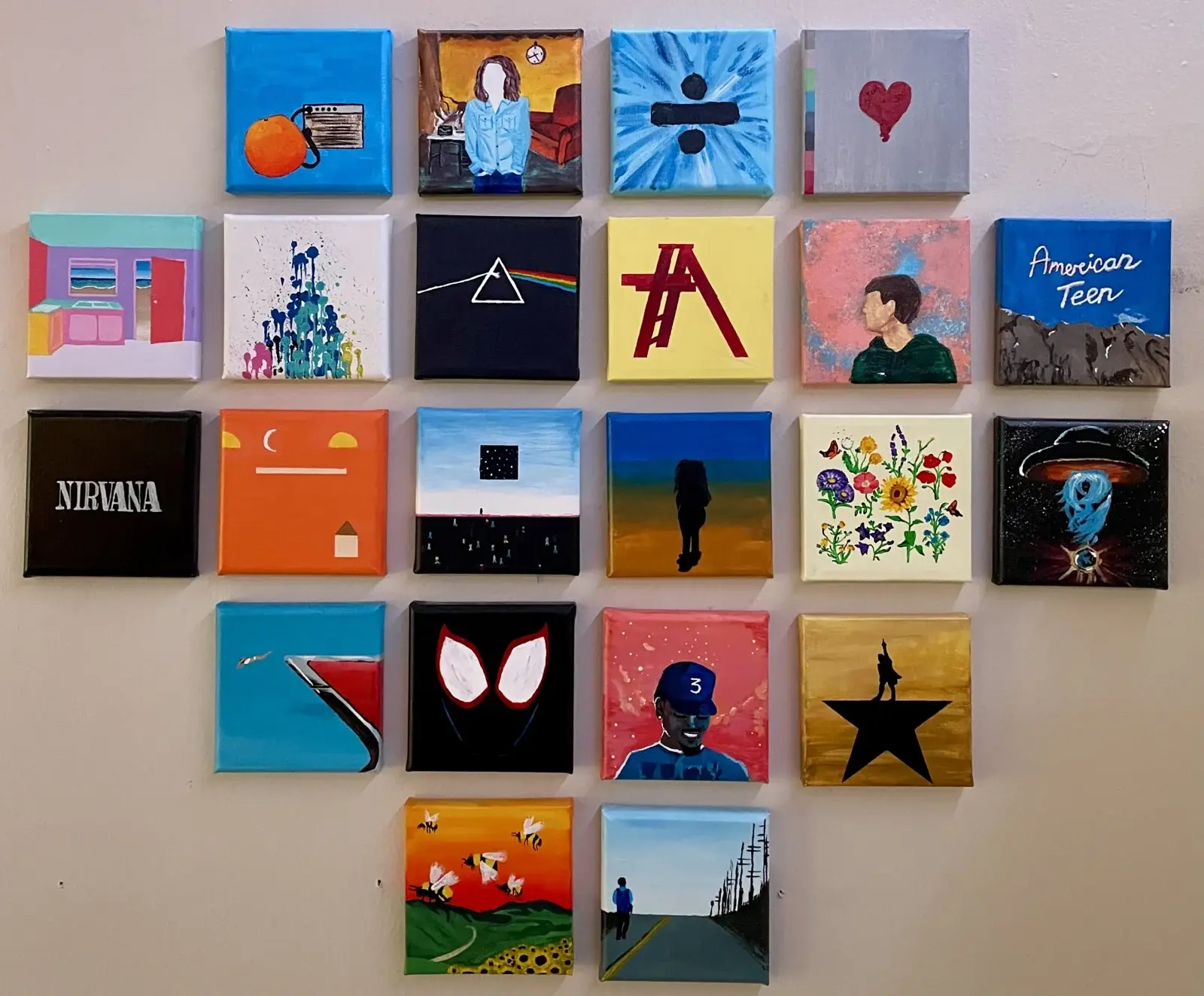
Music Minis
Music Minis is a collection of 22 small canvases, each referencing or reinterpreting an album that defined a particular moment in my life. Created in my college dorm, this was the first piece where I stopped experimenting casually and started committing to the process. Each square became a study in translation — reducing full album artwork into simplified forms while preserving its identity. Working at a smaller scale forced intentional choices in color, composition, and detail. The piece functions almost like a visual playlist. Together, the canvases document the music I was immersed in at the time, but more importantly, they mark the beginning of my practice. This was the work that shifted art from something I enjoyed to something I pursued.